Lens & Lattice
The Challenge
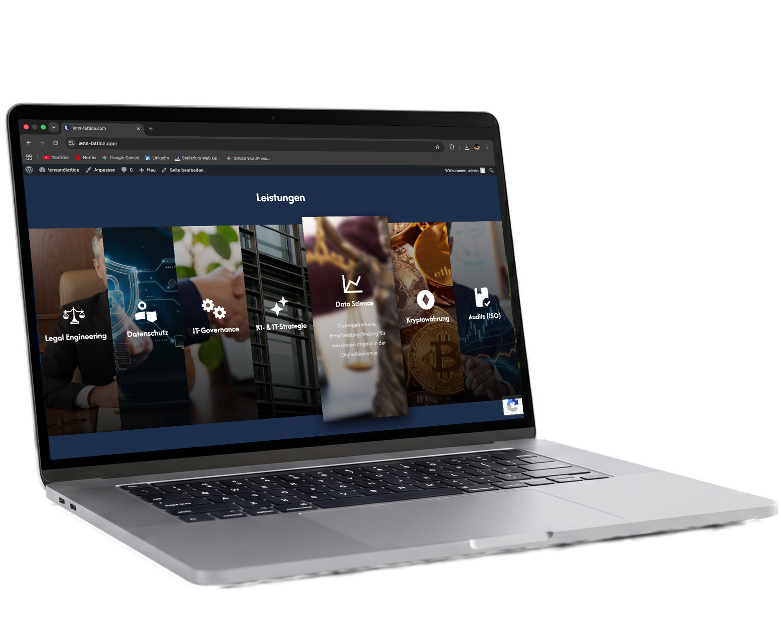
Lens & Lattice Consulting required a multi-page web platform that exudes exclusivity, high-end authority, and classic elegance while remaining deeply rooted in modern web standards. The challenge was to visually balance a traditional, prestigious aesthetic with a contemporary, highly functional digital user experience.
The Story & Execution
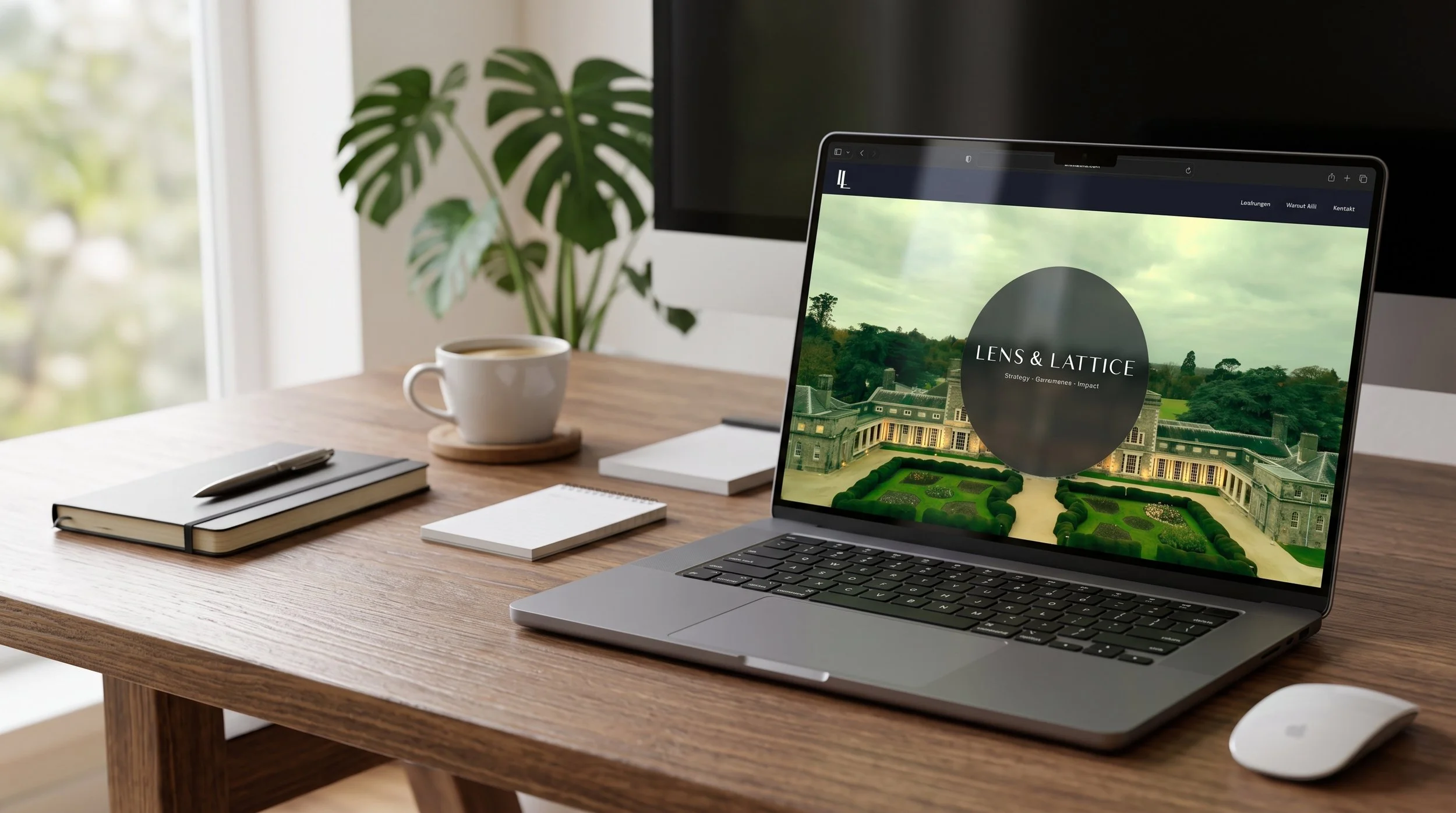
To bridge classic grandeur with modern design, I implemented a layout utilizing a sophisticated glassmorphism (frosted glass) effect. This technique creates a sense of depth and hierarchy, allowing the majestic architectural background to shine through without compromising readability. I managed the entire technical and visual pipeline—from the initial layout generation and precise typography implementation to the final domain mapping and launch via IONOS hosting. The typography pairs a distinguished serif typeface for the main brand with a clean sans-serif for the core pillars ("Strategy · Governance · Impact"), perfectly reflecting a balance of heritage and forward-thinking consulting.


The Logo
To provide maximum flexibility across different media and screen sizes, I developed a versatile, two-part logo system. The primary logo features the fully spelled-out "Lens & Lattice" in a sophisticated serif typeface, elegantly paired with the firm's core pillars ("Strategy · Governance · Impact") to immediately establish authority and context.
For more constrained spaces—such as the top-left website navigation or mobile views—I extracted a sleek, minimalist "LL" monogram. This shorthand version serves as an elegant brand mark that functions almost like a modern seal of quality: unobtrusive, highly recognizable, and perfectly tailored to a premium consulting firm.